Last Updated on April 24, 2017 by Larious

This is the best new social app feature in a long time. Twitter should copy it. Instagram should copy it. Facebook probably already is copying it.
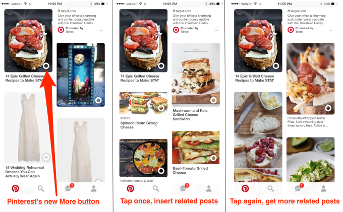
I’m talking about Pinterest’s “Instant Ideas” button that started testing in February but is slowly rolling out to more people. As soon as I tapped it, I was hooked.
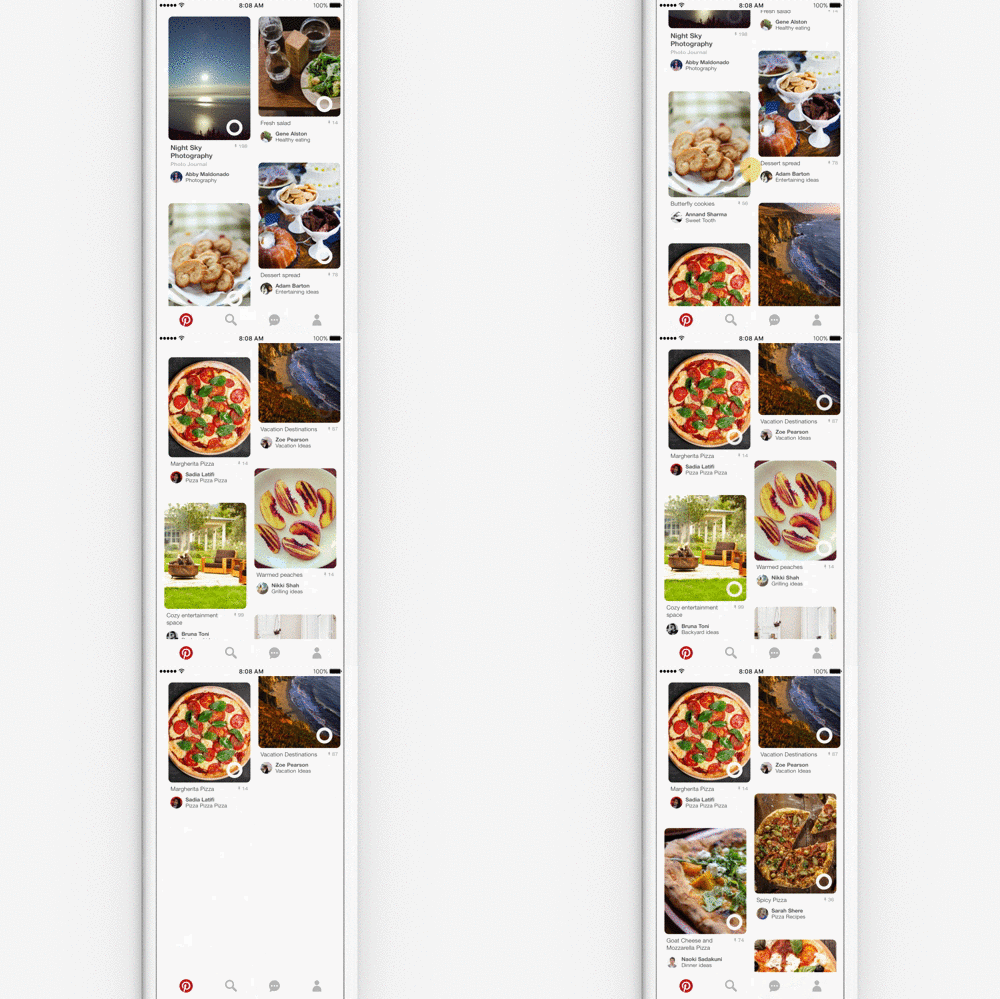
Essentially it’s an elegant “show me more like this” button, but that’s designed to live within a feed, not spawn a separate tab. It appears on every image on Pinterest’s home screen. When tapped on a post, it instantly injects around a half-dozen pieces of content similar to that post right below it.

Your feed could be currently showing you a pasta recipe, a pair of shoes, some home decor, and an arts & crafts project. Tap the circle button on the pasta, and suddenly six more pasta posts slide into view. Tap again and six more are shuffled in. Each tap adds another set of similar content.
But here’s the really clever part: the rest of your feed is still waiting for you. Scroll down past however much similar content you conjured, and you’ll see a diverse mix of posts again. No need to hit the back button, or navigate different tabs, or remember to untoggle some permanent setting. A few thumb flicks and you’re back to your old feed. Just because you wanted to see more pasta options doesn’t mean that noodles are the only thing you care about now.
The result is an unprecedented level of choice and dexterity while scrolling the single, infinite, algorithmically sorted style of feed we’ve grown to love. It’s the next progression in personalization after “In case you missed it”. This button is a lightweight, real-time way to dive deeper into a topic without getting lost down the rabbit hole. And every app needs this button.

Imagine if on Twitter you could instantly see more tweets about the same link or hashtag, or more of the same author’s tweets. Scroll a little further and yo’d return to the main timeline. On Facebook the button could surface more posts from the same keyword, the same location or event, or the same content type like more videos or status updates. Instagram could show more posts with the same color scheme or recognized subjects like sunsets or food.
There are monetization opportunities too. First off, this button could deepen engagement and lengthen browsing session times. Second, it could generate data on user intent and interests. And finally, ads related to the tapped post could be injected alongside organic content.
We spend an enormous amount of time scrolling through feed apps. But right now the best we can do is give a vague signal about “liking” a certain post in hopes the feed will eventually show more in the same vein. But when a breaking news topic, beautiful place, or big event catches our eye, we should be able to summon more about it right away. Pull-to-refresh, meet tap-to-insert-more.


