Last Updated on November 10, 2018 by Larious
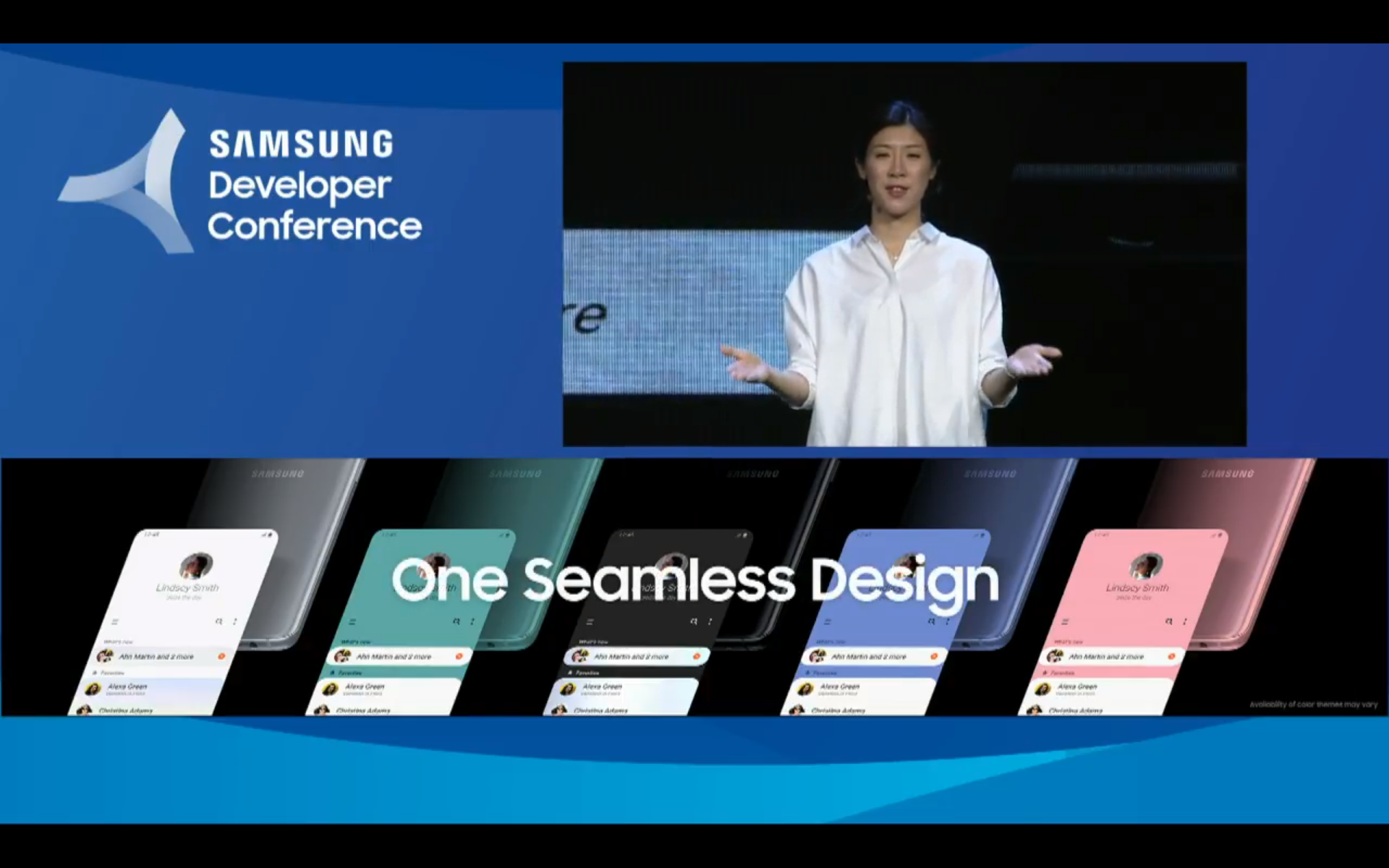
Samsung One UI Software Is Here To Stay – The Samsung Developer Conference opening ceremony served the South Korean company, of course, Samsung to announce many of the new features, both for hardware and software, that we will see in the coming months by the company.
Yes, now according to the latest reports, the South Korean giant Samsung just launched its all-new UI software.
Samsung Just Launched Its All-New UI Software
The Samsung Developer Conference opening ceremony served the South Korean company, of course, Samsung to announce many of the new features, both for hardware and software, that we will see in the coming months by the company.

One of the most talked about, and no wonder, is One UI, the renewed UI (user interface) of the company, of course, the South Korean giant Samsung which comes to replace Samsung Experience, with a more accurate interface and improvements in the user experience as the primary objective.
However, we already know which smartphones will receive, and which will not, this renewed customization layer, and we have even detailed the steps to be able to sign up for the Android Pie beta program that will bring the One UI interface to the Samsung devices. Now, however, it is time to delve into One UI and see the new features included.
The people of SamMobile offer the video, and there is a review of the renewed software that the Samsung Galaxy S9 will enjoy after the arrival of the Android Pie update, scheduled for January next year.
Throughout the video, it is possible to see how the interface changes completely concerning what we are currently accustomed to, as it also changes the appearance of the vast majority of the system’s applications.
The home screen receives the first substantial change: the icons. The South Korean giant Samsung is betting on a flatter appearance, and increasingly away from the principles of Google Material Design. But the changes in the launcher do not go further, but, if you watch the video, then you can see that the quick settings panel got some extraordinary changes.
When accessing the panel by sliding down on the home screen, we will see several quick adjustments along with relevant information such as time and date. But if we slide one more time again, the quick settings panel will occupy the full screen.
Taking a look at the apps pre-installed in the system, we will see that all of them adopt the renewed interface, with a black background -as long as the night mode is used-, and with menus where rounded corners predominate in both information cards and text boxes and images.
In addition to this, a significant change that the South Korean giant Samsung carries out in the vast majority of applications and menus, which consists of dividing the screen area in two, leaving the upper half empty of content, to show only titles, and the lower one with all the components with which the user can interact.
Although it has been a criticized decision, the South Korean giant Samsung indicates that this measure is carried out with the aim of improving the usability of the devices with only one hand, mainly those with large diagonal screens.
There are also changes to menus and shortcut bars, which are placed in the lower part of the applications with the same purpose that pursue the other modifications that One UI brings: improving usability. It also changes the menu of recent applications “overview,” with horizontal carousel format in the style of Android 9 Pie.
It is clear that One UI brings notable changes to the software of Samsung devices, and that the smartphone users of the firm will have to get used to all of them. At the moment, yes, we only have proof that this update will reach two of the models of the brand, the Galaxy S9, and S9+.
Along with them, the company’s first folding mobile, which is scheduled to launch early next year, would be the first to debut with Android 9 Pie and One UI inside. So, what do you think about this? Just share all your views and thoughts in the comment section below.

